Art Critics Thread

I'm confused on how to shade digitally, I usually stick to graphite drawings and acrylic so I have no expertise in this area. I just need some harsh criticism and a digi
[/spoiler]
I absolutely love this, it looks like I'm seeing a traced image of a man, that's a good thing! Proportions are hugely important. You understand that faces need flaws and thickness, which is great! What you need to know is essentially technique, like this
(start at 7:51 and watch until the end of the video, the advice given matters.)
-but digital art is basically about being dependent on the brush pallet. You make your basic sketch, then start off abstract, then get further into detail at a balanced rate. See the man @8:13? That should be the base (the abstract part), you don't start going into detail on the eyes, you need to do it at an equal rate. The man in the video gives good advice about how he got distracted by the essential details of the eyes nose and mouth.

That's how you stylize on digital art. I don't really know anything but this is the best advice I can give until I actually study, feel free to ignore this advice at any time.


Thank you! I one day hope to be as good as the person in that video, if I did not know that was a painting, I might of thought it was a photo.
 
The longer hair lacks any sort of flow, the eyelashes and earlobes are flat, the whole piece mainly lacks depth. Otherwise you've done fine on the balance and intended focus of the painting. I enjoy the soft texture in the shaved portion of his hair. Beards aren't as smooth as the one you've depicted. The ponytail he has should not be visible. Also the proportions of his face are balanced aside from his eyes being misaligned. His ear is not attached to his head and it too lacks depth. On a side note, his ponytail wouldn't be very thick, considering he has red hair(naturally thinner) and it only uses the hair of a small portion of his head.
beard-ponytail.jpg

c44d7a7fdb5bbc3dc599ef75d1fc3568.jpg

See, it can't be on the side of his head like that.

I did a few changes, is this better?

Vidarr.PNG
 
Please, please help/criticize me. Something's absurdly wrong with the anatomy and I can't figure out what.
mariannaportrait1.jpg
 
Where would I go from here? More detail to the clothes with patterns? New background? More shading? My friend says I need to fix her left hand, it's too humanoid while the right is lizard-y.
Fizzysodaexample.png
It's good, I absolutely love the shading on the dress. I think you should make the body larger, broader and taller or make the head slightly smaller. The proportions seems tad off, and the right pinky/thumb/i don't want to do that math is a little awkward.

Edit: Okay, seriously, how'd you do that dress texture, it's fabulous.
 
Please, please help/criticize me. Something's absurdly wrong with the anatomy and I can't figure out what.
View attachment 139809
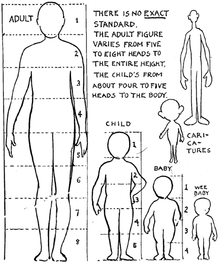
Most noticeable thing is that the head is too big. Usually an adult body is three heads high from the bottom of the pelvis/groin to the bottom of the head (a total of four heads high if you include the head itself). The head is also a bit too forward, usually the abdomen/stomach area sticks out in front more than the face does.
manoutofproportion.png

stock-photo-full-body-side-view-of-beautiful-asian-young-woman-standing-on-white-background-125723900.jpg
How 'bout now?
mariannasketch1.png
 
@Gartono First off I'll say I love Aeslings character for her unique skin. For some reason however, this looks strange to me but done at a novel-art level coloring job which I enjoy! That's no exaggeration. You could be the color-guy for a comic series. Fantasy art has those lovely high contrasts and vibrant greens. So I'm gonna do what I did last time with the black and white thing. I shouldn't be editing your stuff like this but I'm so curious as to what they'd look like.

Aesling.png
change1none.png


So the weird thing I think is that there's a high-key contrast on the jacket and hard natural light on the face. So just a little bit less contrast on the clothes would do wonders to bring the attention to her face instead of her buttons. However, I do enjoy the way you've shaded it.

Her hair is an unrealistic shade of red but I do realize you're using the characters color scheme, which was good to commit to. I wanted to find something wrong with the coloring but I couldn't. You even remembered that girl short hair has a bump at the back.

You have improved a lot since I last harshly critiqued you, but there's something I noticed you forgot to do since the first time. The spot from the lips to the nose is too long. And you could use more definition on the moustache area so she doesn't look like she's pursing her lips. Remember that? Also lips kinda flare out when relaxed, but that's perfectly fine for an art style.

:0 not really a big deal, maybe she's just doing the duck face.
face1.png
face2.png


Tip, you can use the liquefy tool to morph parts like that. It really helps me, personally. Your coloring is still top notch for going at this without any hard step-by-step procedure filters.
Yeah I see that now, my aim was to give her a thin upper lip, just like in my last piece. Thanks for the critique!
 
I just made a diagram because there's way too many words for these little changes.
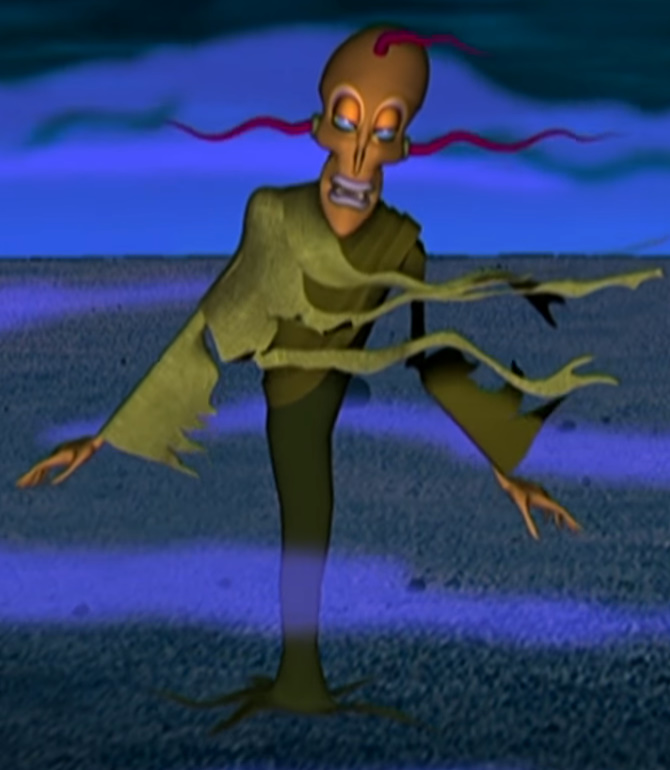
First off I like how you added the background it gives a nice stormy impression. I'm not sure if that's a man or a woman from the intense murder face but if it is a man those are some amazing lips. Because this is a "Style" type of art there's nothing I can really point out incase it's part of the style, but I will say her skin looks really blotchy and I'm not sure if you're trying to make it that way. To fix the blotchy skin I would stop blending things out by smearing outwards with the grey and red and limes everywhere and start using the natural skin pigmentation map for Caucasians and make new colors for each spot. Using the grey like that is giving a cold light, which fits because of how cold she looks with the red nose and ears. Overall if you're trying to make her look like she's in a cold place you succeeded. Also the ears are really small and angled too forward, but otherwise the proportions are fine for your style. There's a problem with the lighting: how she's outside but there's only one bright light source coming from her right. Maybe it's the sun coming over the hill but then why would the sky be darker on the left side. Also you forgot to give the irises the right perspective, (discs, when turned to the left or right, are thinner) Also you can make blue veins for any skin color by desaturating it.
corrections.png

before.png
after.png

You could probably just play spot the difference.
that's a woman believe it or not. ik she looks a little awks, soon im gonna try to take enough adderall to sit down and re-make it.
 
Every good illustration starts with solid fundamentals. That means getting the basic proportions down before worrying about details. Nailing your perspective before worrying about lighting. Making sure your values are where they need to be before worrying about your color pallet.

A common belief many artists share is that you should be able to stop working on an illustration at any point and it will look good, even if unfinished. The idea stems from the good fundamentals principle. If you start sketching out a pose and stop, it should look good as just a gesture pose. If you get to the proportions but lack details like clothes and stop, it should still look good.

Now, obviously there are a ton of great artists who ignore this and just get their rough sketches "good enough" and clean it up when they actually start laying down final lines and produce amazing images, you really have to start somewhere. Usually the artists who throw down super rough sketches that don't look totally great and end up with amazing pieces are just experienced enough to know how to do what they want and are just using those rough sketches to get ideas, rather than as true construction lines like most artists.

If you find yourself not producing images that you enjoy or things that are comparable to the style you're going for, try stopping at each step, poses, construction lines, shapes, etc and figure out where the divergence happens. You'd be surprised how easy it is to spot just where your illustration went wrong.

Unfortunately, given how critical the first steps and the fundamentals are, when you discover your illustration is looking a bit weird, likely the culprit of your problems happened close to the start, which makes it extremely exhausting to backtrack and fix those mistakes and instead usually leads to you giving up on a piece.

Which isn't a bad thing. Giving up on a piece when you know it's not the way you like is a healthy way to keep you motivated in art. It's exhausting and emotionally draining to keep working on an illustration that you think isn't coming out as well as you had hoped.
 
With that spiel out of the way, here's my piece. It's unfinished yet and I'm still working on it, but I wanted to get some feedback to know that I was going in the right direction for this piece. You can clearly see the unfinished sketchy parts that I paint from and how bad my initial sketches really look before I clean them up. Lol.

c2wZ4HD.png
 
Need criticism on the feet, left hand/arm, legs, and blade. (Also whether or not this looks like a lore compliant Mu-allar)
 
His right foot is further behind him but it's the same size as the left foot. Also his tail should be closer to his body, if you turned him to the side it would look like he's lifting his tail but pointing the tip down. You need to work on depth, having things closer be larger and the further be smaller. Also his toesies look like he's jumping dramatically but then none of the rest of him is affected by gravity, so maybe draw him standing on a small surface if his toes are to hang down. Also add more movement to his pants and the loose skirt of his shirt with wrinkles. You need to be more flexible with brush sizes because theres a lot of brush marks on his tail. His shoulders, chest, and arm seem fine to me though. If you use big brushes to draw the sketch its a lot easier to get your imagination down. He's also lore-compliant. I say without knowing perspective or brushes you did pretty good. The shirt/shoulders/stomach/arms is the best part.
View attachment 145435
This is exactly what I need! Thanks!
 
@Gabauchi

I got really excited because gaubachi is doing styles now. On #1 I hate to say it because it looks awesome in the small thumbnail but it's hard to see the character. With an accent color you can differenciate it better. The lighting is the best part I think, but even though it's supposed to be scribby, every line should have purpose, and you need to clean up those unused ones. The accent color makes the character pop out and the idea with keeping the character uncolored is that if a real light were shining she would look desaturated anyways. You missed out on a lot of potential in this drawing because you didnt draw the values right. The lighting and depth is freaking great and if only you managed to highlight your details better, you would have a great piece. The viewers see things differently and the first time I saw it I couldn't differentiate the character from the background until I figured it out. While things seem obvious to you, its always good to clear things up and point them out. There was a lot of great usage of brushes in this. My school ipad brushes match what's on here, did you do this on an iPad? I don't think I could make this.

View attachment 145468 View attachment 145467

I cant really edit the second one to show you, but the shoulder kinda melds into the pillow. I also noticed that you had to add a light outline to the PJ shirt for it to be seen right. This is a clear indicator of the values being off, you should make the wall reflect the light from the window too to fix that. The colors also don't need to be so drastic but it works since there's a small pallet and you're going minimalist. I love cyan and blue art. The moonlight streaming through the windows is a beautiful moment.
From what I know Gab actually uses Krita on his computer!
 
dude thanks a million
With an accent color you can differenciate it better
the first time I saw it I couldn't differentiate the character from the background until I figured it out.
and yeah, the character being seen is a big issue. i might change the values before I color, but the character's gonna be a high-contrast color against the environment so I guess i'll just see where the night takes me

Gab actually uses Krita on his computer!
did you do this on an iPad?
and i used to use krita, but these days it's mostloy photoshop
 
Thanks to @Rubar_ , I was able to greatly improve my artwork! It still has mistakes, but compared to what it was before, as well as the skills I learned from this experience, I'd say the critique was greatly successful.
 
Heya yall,y I just made my first finishes Digital Picture and I have been wanting to know how to improve by color choice or even perhaps brush choice on Corel paint! Anyways here ya go.
 
Please criticalize my avatar. I use a mouse so have mercy. I just need a basic understanding of where I should go and what I should focus on first as I've only been actively trying to better my art for about a year. I mainly wanna try making comics as a hobby and do little requests for friends so I don't put a lot of emphasis on anatomy all the time. Thanks!~
 

https://i.imgur.com/T9PiIEA.png

Actually, when doing this pose, since it's so unique and from an angle that I'm not even remotely familiar with, I decided to load up Design Doll studio and build the form out before starting work on the construction sketch. The link above is the exact screenshot that I worked from. I use Design Doll a lot with weird poses because of how it helps me with perspective, proportions and body manipulation.

Since the form is mostly copied from the pose I created in DD, I trust it to have mostly correct proportions and foreshortening. Not sure where the breakdown is other than that the pose itself doesn't make as much sense in the illustration as it does in the reference. It very well could be that just the difficult way the pose is laid out makes it hard to understand from just the painting. I honestly don't believe any of the proportions are misaligned, so I'm not sure how else to respond.
 
c69c00d6999b5b6ece07841126e4fdc6.gif
f0dff101f219744942beba2bd11edb85.gif
21cc000b0ac5e077d84d37111c29e24e.gif
527b53629b8955545440f8ebdd0696fe.gif


Been experimenting with an app called Sprinter on my laptop, Most of the program requires you to buy packs or the pro version, but considering how new I am to the program I think these came out very well, My next step would be to create large scale scenes with multiple characters involved.​
 
XD Oh shoot, wow. And I had a friend look over it too. Now that I look at it again the proportions are fine. I'm sorry, I'll look over it again in a bit and try to think of something more useful like technique instead. Thank you for telling me. XD critic got critic'd.

No, it's 100% fine. I was just confused what you were talking about for a second. Lol. Had I not used a reference, I definitely would have been second guessing my proportions there.

Design Doll has been a god send in my artwork, though and I super recommend it for artists who are struggling with proportions and poses or even experienced artists who maybe can't find reference for a non-traditional pose like the one I'm using in this illustration.
 
Yet another character art piece done. This one was LONG overdue, but the entire thing has been a learning process, so I'm glad I made it worth the wait.
Jurin.PNG
 
Last edited:
I don't know where to go from here in terms of skin detail!

Always remember to get your highlights and shadows the right value before trying to work on textures.

A common mistake of artists who are learning to paint is not using dark enough darks. Try pushing down the values of the shadows way more to really define the topography of her face.

https://orig00.deviantart.net/d337/f/2018/149/4/7/m__e__wolfram_by_vixikats-dccxp8h.png

Here's the portrait of my character that I drew. Here you can see just how dark I push my shadows around the face and hair and just what it does for the detail of the piece.
 
Welp, this took a long while. This is for my slizzar in progress. Anything I've missed?View attachment 149679
i think this is my favorite piece of yours i've seen to date!, my critique would be to not be so afraid of colors. Adding more contrasts to what you have, and darker colors where the face etchings/whateVER slizzar have, would be pretty neat to look at.
 
The shading for this one is a WIP, as are the finer details, but I mainly need help with the facial features! I really don't like them but I can't tell what's wrong with them. I also don't know how to make slitted blue eyes look good. Any general notes too would be great, though again it's a WIP!

F5515459-5DE3-419D-A9C8-0B99380DA672.webp
 
does anyone know how to draw and shade hair?
pls help.
and how do you draw and shade
in general. cries.

 
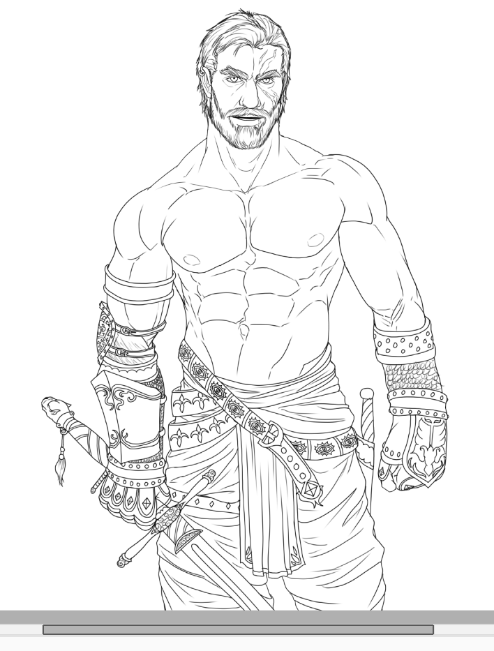
I'll baptise this thread with my latest sketch. I've been toying with detail and proportions for a while now but I'd like to get some fresh eyes to look at it before I start doing the line inking. Do provide critics for the following sketch:
e2babff53a9dfd982492c1842d0415ef.png
The first thing that caught my eye was the fact that what I assume is a form of chain mail (around the fore-arm region) is not affecting the silhouette at all which causes that portion to stand out compared to the detailed linework of the rest of the piece. Secondly, the center line of the torso seems to be angled to the character's right whereas the legs seem to be facing completely forward
(I know I am probably a little late to the party but I thought I'd put some feedback in before posting my own stuff)