You are using an out of date browser. It may not display this or other websites correctly.
You should upgrade or use an alternative browser.
You should upgrade or use an alternative browser.
Art Critics Thread
- Thread starter MonMarty
- Start date


Jouster
stutterer
GOOOLD-eyes???This piece still needs cleanup and I need to finish the shading, but I thought I'd get some feedback before I continue. It could just be artist's bias, but I feel like something is proportionally incorrect. Something about the piece just looks a bit weird.
Any feedback appreciated
View attachment 83546
Nudibronch
Professional Procrastinator
They're supposed to be hazel, but I can see how they would appear gold. I'll fix that.
If that wasn't at all what you meant, I am confused.
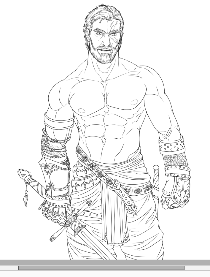
I'll baptise this thread with my latest sketch. I've been toying with detail and proportions for a while now but I'd like to get some fresh eyes to look at it before I start doing the line inking. Do provide critics for the following sketch:

One thing that I look at when I'm giving critiques to artists is to look at a broad set of their works and see exactly what they do and don't do. One of the things I look at all the time is what I like to call "hand confidence," which is essentially a measure of how confident the artist is in their ability to draw hands.
I see artists all the time who draw really well, but sometimes I notice that almost all of their pieces do something to conceal the hands in some fashion, either they're stuffed in pockets, folded awkwardly or are reaching behind the back or head. When I see this consistently, I know the artist doesn't have much hand confidence and I know that's something they struggle with (as do most artists). This is a big reason why in almost all of my drawings, unless the position in the hands is important, I'll tend to draw them in a way where they're clearly visible and in a dynamic pose. It's great practice.
With all of that being said, there are a lot of details going on near and on the hands and it's actually a little difficult to judge the positioning and proportions, but one thing that stands out to me is that the right hand (his left) looks a bit awkward. I'd have relaxed the hand if you're going with a "loose" pose or, if you wanted the fist, tucked the thumb like a proper fist rather than beside the index finger.
At the end of the day, though, the whole thing looks absolutely stunning and even if the hands were completely fugged, I don't think they're a nearly big enough detail to take anything major away from the piece as a whole. I think the illustration would stand up just as well if you had two balls for hands, honestly. Lol.
Looking at your other works though, you definitely have a lot of hand confidence. I adore your artwork.
Last edited:

taintedly
juggalo
- Joined
- Jan 31, 2016
- Messages
- 740
- Reaction score
- 7,338
- Points
- 383
- Location
- sucking lestat de lioncourt’s toes
Tried to do realism. Sort of proud of it. I'm disappointed with how the hair and eyes look, but I like the rest. Tips on pencil sketch shading would be useful af.


soggytoenails
Decogator
Tried to do realism. Sort of proud of it. I'm disappointed with how the hair and eyes look, but I like the rest. Tips on pencil sketch shading would be useful af.
Really nice sfumato techniques and good proportions for the mouth and lower nose. For the eyes, I think the outer corner is angled a bit high and the eye in general could be lowered a tad (this is if you are trying to achieve realistic proportions, however, if you are going for a more stylistic approach it is up to you). As for the hair, you do a nice job capturing the general sphere-like shape with the lighting and shadows. I would even suggest going darker with the graphite in some shadows to get a greater contrast. Not all shading needs to be fully blended
For the hair especially, leave the shading lines as they are because the texture gives the illusion of hair strands. For the skin, careful not to over blend some areas (though it should be more blended than the hair). It really comes down to playing with different textures.Sime shading techniques that I like to use are cross-hatching and sfumato. For sfumato, move the tip of your pencil in a circular motion at a light pressure so that you can control how dark you want it. Personally, I used to do a lot of sfumato but I've moved on to combining the two techniques.
Otherwise, really excellent work
I too am a fan of traditional art. Using graphite takes a lot of patience but with time can be extremely rewarding ^_^taintedly
juggalo
- Joined
- Jan 31, 2016
- Messages
- 740
- Reaction score
- 7,338
- Points
- 383
- Location
- sucking lestat de lioncourt’s toes
Thanks for the help.Really nice sfumato techniques and good proportions for the mouth and lower nose. For the eyes, I think the outer corner is angled a bit high and the eye in general could be lowered a tad (this is if you are trying to achieve realistic proportions, however, if you are going for a more stylistic approach it is up to you). As for the hair, you do a nice job capturing the general sphere-like shape with the lighting and shadows. I would even suggest going darker with the graphite in some shadows to get a greater contrast. Not all shading needs to be fully blended
Sime shading techniques that I like to use are cross-hatching and sfumato. For sfumato, move the tip of your pencil in a circular motion at a light pressure so that you can control how dark you want it. Personally, I used to do a lot of sfumato but I've moved on to combining the two techniques.
Otherwise, really excellent work

SpoopMelon
Literally just a little guy
- Joined
- Jun 17, 2015
- Messages
- 884
- Reaction score
- 3,900
- Points
- 393
- Location
- your mum's bed or something

Beautiful! Your colors blend so wellGimme critique and stuff and things, thx.
View attachment 95085
One thing that I noticed is that you made your freckles perfect circles, and evenly spaced. Natural freckles are usually miscellaneously placed, and come in all shapes and sizes. Overall your art looks great!


Fatherland
Merchant
@WaterDruppel
That's pretty impressive, really. The only issues I can pick out is that the right eyebrow seems a bit too high and the left one's perspective is a bit off, probably should be longer and "wrap" a bit around the head more. Hairline also could use some uniformity, doesn't quite follow the forehead right. Art seems great otherwise!
That's pretty impressive, really. The only issues I can pick out is that the right eyebrow seems a bit too high and the left one's perspective is a bit off, probably should be longer and "wrap" a bit around the head more. Hairline also could use some uniformity, doesn't quite follow the forehead right. Art seems great otherwise!
@WaterDruppel
That's pretty impressive, really. The only issues I can pick out is that the right eyebrow seems a bit too high and the left one's perspective is a bit off, probably should be longer and "wrap" a bit around the head more. Hairline also could use some uniformity, doesn't quite follow the forehead right. Art seems great otherwise!
Yes, I noticed such as well, though the left eyebrow is supposed to be raised. I only saw those flaws too late however, and I'm fairly new to drawing ontop of my line art, so didn't know how to fix that.
Fatherland
Merchant
Yes, I noticed such as well, though the left eyebrow is supposed to be raised. I only saw those flaws too late however, and I'm fairly new to drawing ontop of my line art, so didn't know how to fix that.
Yeah I took a look at the lineart on said art thread, it seems like that portrait has the features tackled pretty well. Great job regardless!
Samfari
Professional Yu-Gi-Oh Duelist
- Joined
- May 25, 2015
- Messages
- 152
- Reaction score
- 809
- Points
- 0
@WaterDruppel Excellent coloring! To be honest, I think your skin texture is fine, but if you really want that realistic skin texture, try emphasizing the person's highlight and shadows. Your face is very "soft" but in order to make it more realistic, use more than one brush. It definitely takes more time and requires you to be more meticulous, but then again you make it your style. The hair definitely requires a little more texture although. I really really like your picture! But if you're trying to lean towards a little more realistic side then cartoony, then you have to put more details into everything, from the neck to the eyes and hair. In hair, you can kinda see lines, but not drastic lines. To be honest I'm really bad at males, but I suppose emphasizing the eyebrows would more it a little more masculine?? Your cheek bone is anatomically incorrect, it's too low. But forreal tho, it's real good!Sooooo, I drew Tuttles' character Hazhim today, a Sun'Ji. I'm looking for some tips regarding texturing skin, and furthermore critics on proportions and the like. Perhaps tips on drawing more mascular faces. Here's the drawing:
 hhhhair texture
Suzzie
elf appreciator

Samfari
Professional Yu-Gi-Oh Duelist
- Joined
- May 25, 2015
- Messages
- 152
- Reaction score
- 809
- Points
- 0
Besides blending, what kinds of brushes do you use? I think using various types of brushes give great textures on specific sorts of areas such as hair or skin. I think adding shading would bring a little ore emphasis on the photo, just my opinion although

Some bad edits but do you get my jig

Samfari
Professional Yu-Gi-Oh Duelist
- Joined
- May 25, 2015
- Messages
- 152
- Reaction score
- 809
- Points
- 0
Nice proportions! And yes, shading is an integral part of how to make an illustration have more dimension but understanding color is another necessary component of it as well. I also wouldn't put any hard lines in shading, unless that's your style. Overall, good work!View attachment 101345
i'm kinda okay with the result but i still need to figure out shading
The blending tool is your friendView attachment 101345
i'm kinda okay with the result but i still need to figure out shading

Cyliah
Cute Sunflower by Day, Sassy Bitch by Night.
- Joined
- Mar 11, 2014
- Messages
- 114
- Reaction score
- 393
- Points
- 0
i knoww, but i can't find any in fire alpaca >.<
oooooh you're using fire alpaca? I used to use that, the company made a more improved version of fire alpaca called Medibang Pro. I suggest you use that, that's what I use! (It has a cleaner format and more brushes) You can also look online for downloadable packs for brushes that you can easily insert into your program. I'll send you links to some brush packs when I'm not on my phone

taintedly
juggalo
- Joined
- Jan 31, 2016
- Messages
- 740
- Reaction score
- 7,338
- Points
- 383
- Location
- sucking lestat de lioncourt’s toes
Any advice about this art I did of my vilitatei? Please note, this is my first time doing legit digital art and trying to use layers and stuff. I did this while simultaneously trying to figure gimp out.

The shading is supposed to be cell shading, sort of like this. But not as good because I'm a noob at digital art.
The shading is supposed to be cell shading, sort of like this. But not as good because I'm a noob at digital art.
Try making the hair a bit less jagged, and work on the size of the neck and shoulders. I'd also work on the shading, yes. Maybe get a better program.Any advice about this art I did of my vilitatei? Please note, this is my first time doing legit digital art and trying to use layers and stuff. I did this while simultaneously trying to figure gimp out.
View attachment 102504
The shading is supposed to be cell shading, sort of like this. But not as good because I'm a noob at digital art.
Gabriel
*wants to make a joke about insanity, but loses it
Any advice about this art I did of my vilitatei? Please note, this is my first time doing legit digital art and trying to use layers and stuff. I did this while simultaneously trying to figure gimp out.
View attachment 102504
The shading is supposed to be cell shading, sort of like this. But not as good because I'm a noob at digital art.
Work on longer strokes to lessen the shakiness of your lines and increase crisp smoothness.
Your hairline is too high, keep in mind that it shouldn't be so far away from where the eyebrows are set.
For the hair, study how it naturally flows and to keep in mind of flow and gravity that affects it. For your shading, Don't use black. Look into contrasting colors and then from that base contrast color, lower it to at least 15 or 20 ticks for a more dimensional effect. Also for shading, study where your light source is, to give the picture more depth.
Great picture, and keep at it!
Edit: In addition, if you're using a digital tablet, GIMP isn't the best program to use. It's great for effects, but not for drawing since it lacks ppen pressure/stabilizers. Depending on your type of computer, look into Paint Tool SAI, or FireAlpaca. Manga Studio/ Clip Studio Paint is also a great program.

 Some character study for a character that I'm planning to make for a comic! It's only black and white but I have a properly coloured one of her somewhere. Only the chibis are shaded. (edit: that hairline is way off oh geez)
I drew my uh, Sakhar Slizzar character, i think she looks pretty ok. but I'd like some critique from real artists. (excuse the poor quality i had to save it as JPEG, cries)


SpoopMelon
Literally just a little guy
- Joined
- Jun 17, 2015
- Messages
- 884
- Reaction score
- 3,900
- Points
- 393
- Location
- your mum's bed or something

Ponyrock
Slightly Bipolar Winter Elf
Digital clothes! I was working on clothing but what I am finding tricky is finding the thickness and directioning of folds and divets in clothing. Shading is also a bit tricky with the clothes too.

Gabauchi
Goblin Babe (Local Hotsexy)
- Joined
- Dec 14, 2013
- Messages
- 1,499
- Reaction score
- 4,414
- Points
- 0
- Age
- 24
- Location
- Space
- Website
- moistester.tumblr.com


i tried my best this time and I think I'm hitting a wall. anyone got any advice from where to go from here?
FlossyBerryRene
Meow!
What's a good lineart setting for PAINT TOOL SAI, I like mine but when it shows up on computer it looks so edgy if you see what I mean, I also would like a good setting for sketched outlines

nightingalesweet
sad lil' lilypad
Sketched outlines I usually use like, the Pen Tool on low opacity, and lining I usually use the Inking Pen.What's a good lineart setting for PAINT TOOL SAI, I like mine but when it shows up on computer it looks so edgy if you see what I mean, I also would like a good setting for sketched outlines View attachment 106126
Gartono
The Blood Banker
- Joined
- Jun 5, 2013
- Messages
- 86
- Reaction score
- 163
- Points
- 0
I have just three thing to recommend:Here's a sketch of my own. Kinda messy too. Trying to work on facial features and colour palettes. I don't exactly understand how to shade blonde hair so it looks kinda funky.
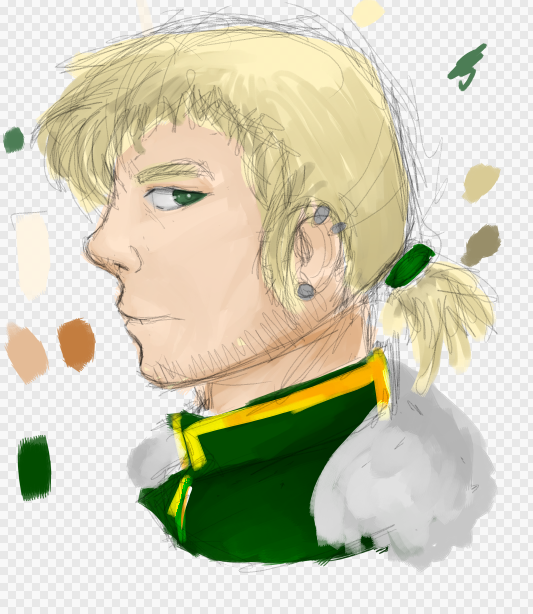
The jaw line ends and goes up bellow the ear, so it connects.
Add more brightness and highlights to it, like the cheek mostly. As well as making the shaded areas darker. It will help pop out the image. I know its scary to get into dark and light shades when you aren't used to it!
Lastly, Instead of drawing the hair strand by strand, draw the general outline of it. Then, get a base color and fill that in. After that, start to make hard line shadows within areas of the hair that are suppose to be darker/shaded. Then add highlights like the same. Finish it off by detailing, though focus more on detailing the areas where the base color is most predominant. Sometimes this applies to detailing through highlights, but not through shadows, as details would naturally be harder to make out in shaded areas.
Remember not to be scared to go too dark or light! I recommend saving your drawing before doing so if you feel uncomfortable.
I hope it turns out great!
Gartono
The Blood Banker
- Joined
- Jun 5, 2013
- Messages
- 86
- Reaction score
- 163
- Points
- 0
I do not know for sure if this is just a trait of his, but to even out the look of all that facial hair, try adding body hair, like the abdominal hair or perhaps arm or chest. If you intend on doing this when coloring and shading, then ignore everything I've said!I'll baptise this thread with my latest sketch. I've been toying with detail and proportions for a while now but I'd like to get some fresh eyes to look at it before I start doing the line inking. Do provide critics for the following sketch:
IT LOOKS AMAZING.
taintedly
juggalo
- Joined
- Jan 31, 2016
- Messages
- 740
- Reaction score
- 7,338
- Points
- 383
- Location
- sucking lestat de lioncourt’s toes

Gartono
The Blood Banker
- Joined
- Jun 5, 2013
- Messages
- 86
- Reaction score
- 163
- Points
- 0
Add more shading to the face. It looks to be of an image with light coming straight at it, so the outline of the head and the outer sides of the face and such would be darker to help give a 3d look.I tried again, and I think it came out a lot better. Still would like any criticism I can get on it, though.
You are making great progress!
Gartono
The Blood Banker
- Joined
- Jun 5, 2013
- Messages
- 86
- Reaction score
- 163
- Points
- 0
Awww too kind!I WANT ADVICE TOO @Gartono <3
View attachment 109312
this is my pathetic attempt to include a light source in my shading
Add much darker tones around the face. Do not be afraid to go too light or dark! Think of shading using a front on light source like a topographic map. The face and all of the drawing is the land and mountains. The parts of the face closest to you are going to be much lighter than the parts farther away. Add some highlights and maybe even a richer tone of the red to make the eyes so the colors pop! strands of highlights in the hair would be amazing, as you can tell that not much more dark tones can go into it. Remember when shading that instead of moving the tone straight down on the color box/circle, to instead change the color depending on the environment. if it is outside at night, make the shadows more blue or indigo. If it is in a tavern setting, make the shadows warm, like a red or amber, or even dark orange.
I love the design of the drawing!
that drawing is literally nearly a year oldI have just three thing to recommend:
The jaw line ends and goes up bellow the ear, so it connects.
Add more brightness and highlights to it, like the cheek mostly. As well as making the shaded areas darker. It will help pop out the image. I know its scary to get into dark and light shades when you aren't used to it!
Lastly, Instead of drawing the hair strand by strand, draw the general outline of it. Then, get a base color and fill that in. After that, start to make hard line shadows within areas of the hair that are suppose to be darker/shaded. Then add highlights like the same. Finish it off by detailing, though focus more on detailing the areas where the base color is most predominant. Sometimes this applies to detailing through highlights, but not through shadows, as details would naturally be harder to make out in shaded areas.
Remember not to be scared to go too dark or light! I recommend saving your drawing before doing so if you feel uncomfortable.
I hope it turns out great!
he finished it ages agoI do not know for sure if this is just a trait of his, but to even out the look of all that facial hair, try adding body hair, like the abdominal hair or perhaps arm or chest. If you intend on doing this when coloring and shading, then ignore everything I've said!
IT LOOKS AMAZING.
just wanted to inform you
Gartono
The Blood Banker
- Joined
- Jun 5, 2013
- Messages
- 86
- Reaction score
- 163
- Points
- 0
Increase canvas size and therefore increasing the brush. It will help hide the 'pixlation' of the program and allow much smoother lines. If you are talking in terms of the lines them selves, just take time making smoother outlines!What's a good lineart setting for PAINT TOOL SAI, I like mine but when it shows up on computer it looks so edgy if you see what I mean, I also would like a good setting for sketched outlines View attachment 106126
Your drawings are very different, and by different I mean I love it.
Similar threads
- Replies
- 0
- Views
- 192