Art Critics Thread

MonMarty

Thotdodger
Staff member
Lore
Joined
Jun 29, 2012
Messages
4,429
Reaction score
34,414
Points
663
Age
33
This thread exists primarily to help the community self improve, but also to give artists practical and constructive feedback on how to improve their work and/or sketch. In order for this to work as intended, an artist will post a sketch or image and request feedback. Anyone can tag/quote them and provide feedback. Remember, even if you're not an artist, you can always provide feedback and no matter how skilled you are at art, any feedback is always welcome to any artist! Some additional rules:

  • Artists should post here well with the knowledge not to receive praise, but criticism. Don't expect positive messages, only suggestions for improvement. If you cannot handle criticism, please do not post here.
  • All criticism must be constructive. If you think a person's color usage is bad, say "This color usage makes the shading look dull, try using dark purple as a shading color to enrich the underlying color layer" or "The eyes are too far up, I suggest moving them down a bit". Always offer suggestions when you criticize.
  • It is mostly suggested to post sketches here so you can get feedback before completing them, but you can also post finished works for future reference.
  • Anyone is allowed to be an art critic, even those that cannot draw themselves or feel they are much worse at drawing than the artist they are about to critique. Just because you can't reproduce something doesn't mean you can't see what's wrong with it.
  • Artists should avoid trying to legitimize, disprove or otherwise excuse criticism. Simply post your art, receive feedback and do with said feedback what you want. Do not start replying to feedback trying to disprove said feedback.
  • Only post when you have actual criticism, don't just post "That looks great I have nothing to critique!" This thread is about helping artists get better, not telling them they are fine the way they are. Do not clutter the thread when others might offer better critiques.
 
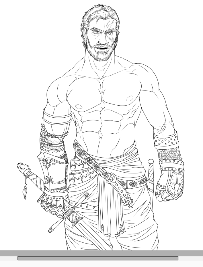
I'll baptise this thread with my latest sketch. I've been toying with detail and proportions for a while now but I'd like to get some fresh eyes to look at it before I start doing the line inking. Do provide critics for the following sketch:
e2babff53a9dfd982492c1842d0415ef.png
 
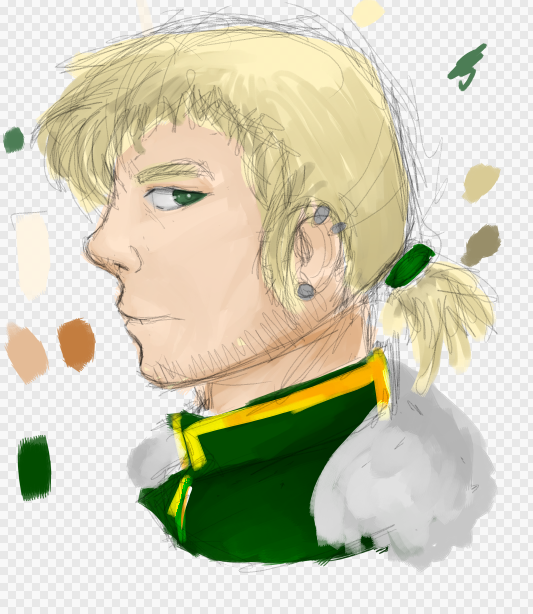
Here's a sketch of my own. Kinda messy too. Trying to work on facial features and colour palettes. I don't exactly understand how to shade blonde hair so it looks kinda funky.

51bec676fe40bc380b391da4065f1c4c.png
 
Here's a sketch of my own. Kinda messy too. Trying to work on facial features and colour palettes. I don't exactly understand how to shade blonde hair so it looks kinda funky.

51bec676fe40bc380b391da4065f1c4c.png
On the hair shading, maybe make around the top lightest, and around the bottom the darkest? I don't know where your light source is, so I might be wrong.
 
On the hair shading, maybe make around the top lightest, and around the bottom the darkest? I don't know where your light source is, so I might be wrong.
Here's a sketch of my own. Kinda messy too. Trying to work on facial features and colour palettes. I don't exactly understand how to shade blonde hair so it looks kinda funky.

51bec676fe40bc380b391da4065f1c4c.png
For any sort of shading I'd try to use more colours. For example, instead of what looks like going darker-blonde for a darker shade, try going slightly to darker warm colours like orange or cold colours like blues, etc, etc. This applies to all colouring, but ye. And shading does depend on the light source. I might add some more later but that's it for now.
 
For any sort of shading I'd try to use more colours. For example, instead of what looks like going darker-blonde for a darker shade, try going slightly to darker warm colours like orange or cold colours like blues, etc, etc. This applies to all colouring, but ye. And shading does depend on the light source. I might add some more later but that's it for now.
So. Completely different colours like blue, and you just blend that in?
Do you have any advice for colour skin too? because you do it so well ;v;
 
So. Completely different colours like blue, and you just blend that in?
Do you have any advice for colour skin too? because you do it so well ;v;

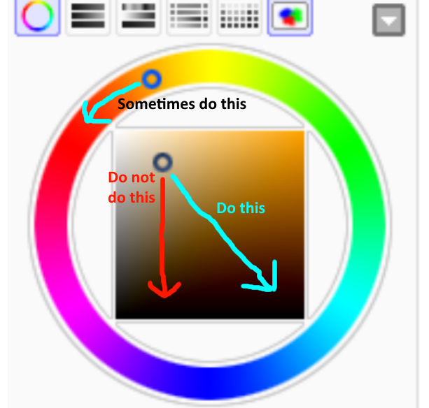
This explains it better perhaps
21595a757f81ef224bc565157a3c28ff.png

Only use blue color when your scene is cold as in night, but sometimes also use purple in such cases. Purple/blue work really well for night.

This is shaded with blue, this is shaded with warm tones

Also LAYERS Use layers. Multiply / Luminosity
 

I'm trying to work on shading and facial features. Something about it looks off but I can't put my finger on it.​
 

I'm trying to work on shading and facial features. Something about it looks off but I can't put my finger on it.​
The head could use more definition, especially around his left cheek area. His lower right jawline is a bit off, it makes the angle of the face confusing since his face looks like its being viewed head on but the jawline looks like a three-quarters view since we can see it extending back. Mouth seems a bit low but otherwise proportions seem fine.

For shading, I'd suggest playing around with contrast. Take a bigger risk and try using really dark and really light shades instead of staying around the same area.
 
I'll baptise this thread with my latest sketch. I've been toying with detail and proportions for a while now but I'd like to get some fresh eyes to look at it before I start doing the line inking. Do provide critics for the following sketch:
e2babff53a9dfd982492c1842d0415ef.png
Try playing around with line weight. The head stuck out the most for me since that's where my eyes went first when seeing it, it seems fairly heavily lined, more so than the rest of the image. The hands and lower body come second in that regards but the chest area kinda fades.

I keep finding myself focusing on the head, it seems so darkly and prominently lined that I start seeing it separate from the rest of the image like its just floating there.
Edit: it kinda becomes more noticeable once you look at the smaller thumbnail.
 
Last edited:
I'll baptise this thread with my latest sketch. I've been toying with detail and proportions for a while now but I'd like to get some fresh eyes to look at it before I start doing the line inking. Do provide critics for the following sketch:
e2babff53a9dfd982492c1842d0415ef.png
Just before I comment is the raised shoulder to indicate he's in motion (ie: stepping forward/ lifting his hand), a shoulder shrug or is his natural pose just loose to one side?

(Just so I know if the rest of the body agrees with it in terms of positioning)
 
Just before I comment is the raised shoulder to indicate he's in motion (ie: stepping forward/ lifting his hand), a shoulder shrug or is his natural pose just loose to one side?

(Just so I know if the rest of the body agrees with it in terms of positioning)

Loose natural pose.
 
I'll baptise this thread with my latest sketch. I've been toying with detail and proportions for a while now but I'd like to get some fresh eyes to look at it before I start doing the line inking. Do provide critics for the following sketch:
e2babff53a9dfd982492c1842d0415ef.png

Just to add, I feel the next step you could take to improve this would be to find ways to accentuate the details on the lower part. Right now it seems kinda flat, meaning that there's a lot of detail and every line is fairly uniform so it all kinda gets lost with each other. I feel it'd improve if you could add more depth and texture such that each individual detail can stand out and be more distinguishable from the others and yet still work as a whole. I'm not sure how you could go about this, especially for a line drawing, other than playing with line weight. Maybe experimenting with short strokes and broken lines instead of long single strokes?

Or even omit detail. The amount of detail is fairly uniformly distributed as well. Maybe if you took out some of the folds of the pants, it'd make the armor and stuff stand out more and look better.
 
I'm gonna put a small rough doodle I did earlier on. Critique it, I'm trying a new style.
I also did a small chibi doodle. I got attached to brown.
 
Last edited:
I'll baptise this thread with my latest sketch. I've been toying with detail and proportions for a while now but I'd like to get some fresh eyes to look at it before I start doing the line inking. Do provide critics for the following sketch:
e2babff53a9dfd982492c1842d0415ef.png
I think his abdominal muscles should be moved slightly to the right, to make it look more natural. I'll provide you an example, to make it clearer :3
Perhaps following the line here
MfSdhVD.png
 
I'm gonna put a small rough doodle I did earlier on. Critique it, I'm trying a new style.
I also did a small chibi doodle. I got attached to brown.

Please don't judge me for critique-ing multiple posts when I'm not an amazing/experienced artist and being super hypocritical ;-;

The style of the first one is really unique and cute! ^-^
I feel like the face should extend down more (longer cheeks) before joining to the chin, as it's rather unnaturally shaped.

The hair also looks a bit solid, as its sticking out (particularly the right side) without anything beneath it, maybe hang it down a bit or maybe add some shoulders for the hair to sit on/flow down from? (You could also include the hair behind the person's neck that bends round to meet the front as a support instead?).
 
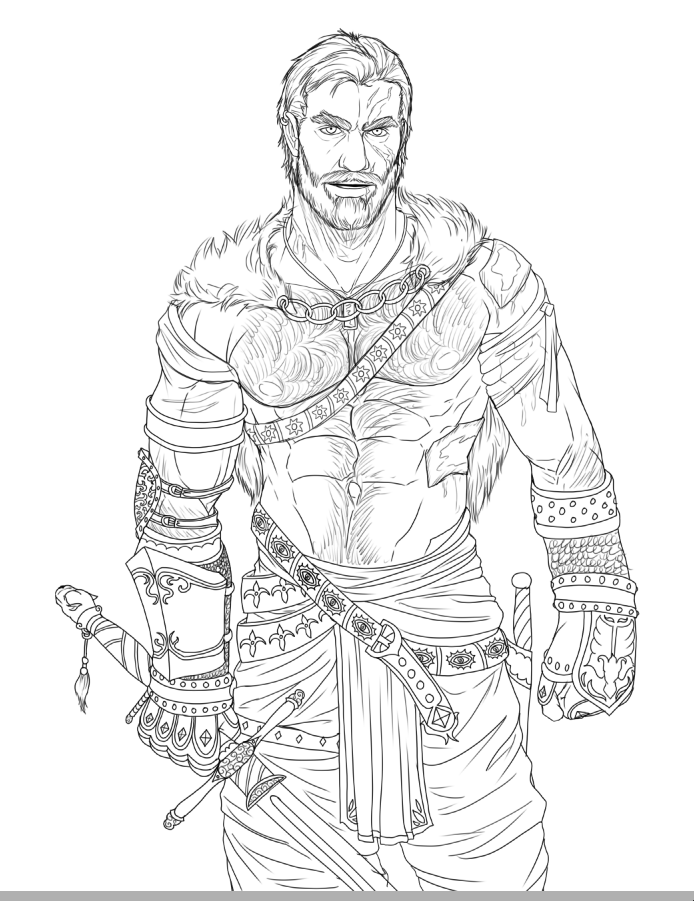
Doing one last feedback roll before I start with inking. Loaded up some tuts on line weight for the actual inking process but I figured moving the proportional detail balance up and moving the abdomen slightly more centered would drastically alter the sketch, so here goes the last round before lining

1a1fedd324595d33a409145c293c62a3.png
 
Oh, definitely. I was going under the assumption that it'd be a line-only drawing. Color and shading is a whole diff story.
For this last version, I can't think of anything else to add except to repeat the comment about his left chainmail.

I'm gonna put a small rough doodle I did earlier on. Critique it, I'm trying a new style.
I also did a small chibi doodle. I got attached to brown.
For the first one, the hair highlights might work better if they were in vertical strokes that follows the length of the hair. In terms of shading, you should try more harsher brush strokes, the shading is smoothed and blurred right now which kinda makes it look a bit too glossy and gradient-like. I feel you'd improve if you aim for more rougher transitions between light and dark.
 
Here is a drawing of basic upper-body anatomy that I recently did.

Something just feels... Off. I don't know if it's the arms, the chest, the head, I'm not sure. The main thing I'm concerned about is proportions. Any suggestions are greatly appreciated!

:)

 
Here is a drawing of basic upper-body anatomy that I recently did.

Something just feels... Off. I don't know if it's the arms, the chest, the head, I'm not sure. The main thing I'm concerned about is proportions. Any suggestions are greatly appreciated!

:)

First thing I noticed was that the neck, in my opinion, is a bit too thick. Try drawing it resting just in a little from the corner of the jaw.
 
I would love your opinions on this. (I know the hair isn't centered, I noticed this a bit after it was complete.)
Reuben.PNG
 
I would love your opinions on this. (I know the hair isn't centered, I noticed this a bit after it was complete.)
View attachment 74222
Proportion wise, the eyes are too big, unless that's the style you're going for. Also, the mouth is a bit too low. I'd also recommend you do straight lines or curved lines (in then out again) for the neck.

EDIT: For the mouth, that line is in the right spot for the lower lip, so if you're not planning on drawing the upper lip (which is fine), try to find a happy medium.
 
I would love your opinions on this. (I know the hair isn't centered, I noticed this a bit after it was complete.)
View attachment 74222
Love your style! You should work a tad on proportions, they're important even in not-realistical drawing styles.
Heighten the mouth and make jaw less square, otherwise it looks great :P
 
I would love your opinions on this. (I know the hair isn't centered, I noticed this a bit after it was complete.)

I think the next step you need to take is to study facial anatomy, and how it forms around the skull. At the risk of sounding callous, the features look plastered onto the face. To add, the proportions of the features are all over the place. Another major gripe would be the mouth, which is far too low. Studying the jaw and how it connects to the skull helps immensely with placing the features.

Also, the angles of the face are all over the place. Here's a massively helpful tutorial that I used to jog my memory on facial alignment.

Something feels awkward here... Any suggestions?

Its a good start, but I believe the nose is too far defined. The eyebrows are also a little too large, or the hair is a little misplaced. The eyes could also use a bit more definition, with folds and wrinkles to give it more volume.
 
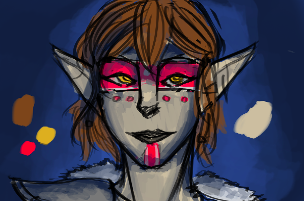
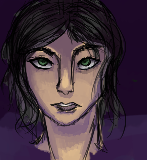
4f6c2aa55e6210300834578960a956be.png
251729efa1178bb6faf7cabcf83a9956.png
I tried shading with purple and blue like suggested at one point. The blue looks like a mess.
Am I using the colours wrong or?
 
Last edited by a moderator:
4f6c2aa55e6210300834578960a956be.png
251729efa1178bb6faf7cabcf83a9956.png
I tried shading with purple and blue like suggested at one point. The blue looks like a mess.
Am I using the colours wrong or?

Regarding the top one, what I'm gonna call the eye-strap isn't shaded correctly. I'm no expert, but it looks like it's a flat piece of wood that just has some eye holes cut out. You did an excellent job showing how the rest of the face curved backwards (if that makes any sense), and due to the darker section at the top part of the eye-strap makes it seem as though it's more of a flat object. I know that sounds really weird and probably doesn't make sense... Tell me if anything needs clarification.

Regarding the bottom one, if you have a single light source, the light is coming in a bit awkward. From what I can tell, the light is angled slightly upwards. If that's the case, then the colors right above the eyes and the eyebrows should be darker, not brighter. However, if you have multiple light sources, this wouldn't exactly be the case.


Besides that, really well done! I've tried color a few times, but after a few failed attempts, I've decided to stick with black and white shading until I get a feel for it. Seriously, nice job!

Might you possibly be taking commissions?
 
@Suzzie a quick add-on. In the second drawing, you need to keep in mind that the entire nose sticks out further than the rest of the face, not just the tip. At around halfway up the nose, the nose is the same shade as the rest of the face. This makes it seem that the nose is flat until it reaches the tip. Although the 'upper' part of the nose will be darker than the tip near the 'bottom,' it still will be a shade lighter than the face due to the fact that it sticks out further than the face.

Keep it up! Cheers!
 
omg look Rosealyn

@MrHappyTinkles- To be honest I can't colour but I can have a say so here I go with constructive criticism:
  1. You've done a nice job with the skin, you've shaded the necessary parts & highlighted. You might want to perhaps focus on where your light is coming from as well, where does the skin shine (such as lips, nose tips, forehead etc.) Try blending in some of the highlights too! Another thing might be to darken areas as to show shadow/depth too (neck/jaw).
  2. The hair.. Ah. I can see you put time & effort into the skin but why not the hair too! It is very 'sketchy' if I may say, so try blending it in more with light/dark colours & adding in the highlights from the light source.. Follow the natural hair wave, play with colours & it'll do wonders.
  3. Maybe try playing around with eye shading too? Lights, darks, opposing colours n' what not.
I would like to also yell out a quick helper thing I've learnt through drawing/photography:
Find a live subject, find a plain wall & use a lamp as your light source (put the person in the same position as desired drawing). Find where everything darkens or becomes lighter & apply it to your work. Have a look at some snazzy tutorials too if you cannot do this.

Nice work! I do hope this helped a bit,
-Celtic
 
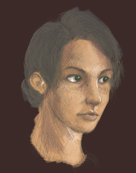
I colored in one of my sketches, paying special attention on the skin. Would love some advice from someone who actually knows how to color things.

34c06d5de40c977224c05f08c01b0baa.png
Stunning work as always, Tinky-face~

Perhaps it's a stylistic thing, but I am coming to see this portrait as oddly grey -- color wise, that is. The colors seems weirdly desaturated, and while there's perhaps a sense of realism in that, I feel that certain things can be sacrificed in the name of making a better image. I think my main problem with the piece is just the color of the hair, though having it a strict black could look funny too. In any case, despite the muteness of the colors, I really do adore the skin color.
 
4f6c2aa55e6210300834578960a956be.png
251729efa1178bb6faf7cabcf83a9956.png
I tried shading with purple and blue like suggested at one point. The blue looks like a mess.
Am I using the colours wrong or?
The actual concept of the two pieces is really nice. Your style is definitely developing dynamically into something beautifully tangible and substantial. I think the two jarring things from these two pieces are the noses -- compared to the rest of the piece in either of the two, the nose feels the most haphazard and 'mocked-up' as it were. Perhaps if you played with more with a thinner, curvier line, it could create a more independently unique nose shape to each portrait and face.
 
I felt a bit more confident with what drawing skills I have, so I am looking for any criticism on this 5-8 minute sketch of a Ch'ien-Ji (Done with a pencil on paper. Oh, and I noticed the jaw is a bit too far out lol).
image.jpeg
 
I did a thing for Ryria. I'd like to see some suggestions on what I could do to improve my drawings in the future! ^-^
F8Whrtg.png
 
I felt a bit more confident with what drawing skills I have, so I am looking for any criticism on this 5-8 minute sketch of a Ch'ien-Ji (Done with a pencil on paper. Oh, and I noticed the jaw is a bit too far out lol).
Yes, definitely move the jaw inwards a bit. He looks somewhat like an Orc at the moment because of this. The structure around the eyes looks a little flat, so I suggest adding stronger curves. For this, I often look at my own face, study it, and find the basic shape of the skull. From there, I tweak until it's how my character is suppsoed to look. The ear is too oval-ish, so I suggest doing the same with that. Proportion seems good in my opinion, though the head looks slightly long. Perhaps try moving the jaw up just below where the mouth currently is and adjust accordingly?

Overall, work on facial anatomy! Find some tutorials online if you need help. Wonderful start with this sketch though! It's a great baseline for a portrait.
 
I did a thing for Ryria. I'd like to see some suggestions on what I could do to improve my drawings in the future! ^-^
F8Whrtg.png
It seems like you're going for a more cartoon-like style, which I find works best with thick outlining around the features and very subtle shading. I'd perhaps move the nose down a little, but it still looks good to me as is. Maybe add different colors if you shade to liven it up a bit more? Skin tones are often portrayed with blues and reds as well as the pink that we usually see. Good work so far!
 
I'd like any advice I can get on how I could improve this.
 

Attachments

  • image.jpeg
    image.jpeg
    1,014.3 KB · Views: 26
i need some critique on my coloring ;w;
btw btw this was a collab with my friend, I did the coloring, she did the sketchhhh
 

Attachments

  • Screen Shot 2016-05-29 at 11.52.27 AM.png
    Screen Shot 2016-05-29 at 11.52.27 AM.png
    234.1 KB · Views: 69