- Joined
- Dec 3, 2015
- Messages
- 91
- Reaction score
- 60
- Points
- 0
This will be a somewhat short one.
For those who do not know, Massivecraft recently updated to 1.9, and with it they updated the resource pack. Among the changes to the resource pack was the changing of Netherbrick blocks, stairs and slabs to an entirely new design. Not only design, but colour scheme. They changed it from a dark red colour, to a very light brown colour.
This was a horrible move on the part of whoever designed it, because it was essentially like walking up to anyone who had ever used netherbrick in a build, and punching them in the face, really really hard.
You see, before the 1.9 changes, Netherbrick was red. And so, if you wanted to build with netherbrick, you used something that would match that colour so it didn't look awful. This is also the case for default, mind you.
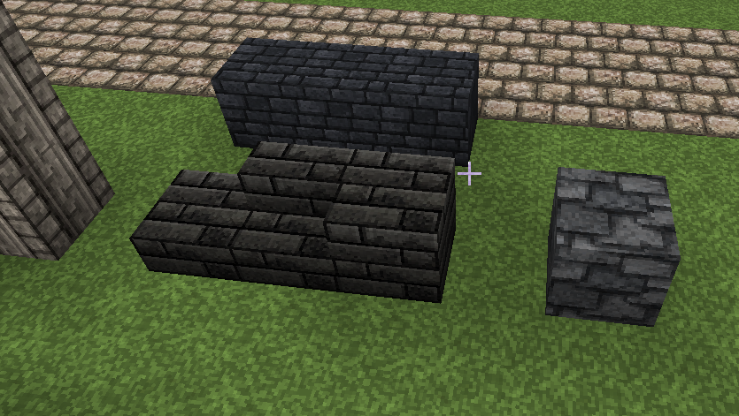
But now with the new resource pack, things that looked like this:


Now look like this:


Essentially, here are the pros and cons of this change.
+ You get a new Light Brown block to work with
- Most of your previous builds with the long-established block no longer work
- It no longer matches the place it comes from (The nether)
- You lose a much rarer Red block to work with
- Things with it that look good in default will most likely not look good with Massive Texturepack and vice versa
Maybe the staff changed it for something in Regalia, it looks like the block would maybe now fit in there. But the problem is that is that it's a rather strong disregard for anyone who had used the block before.
I propose that the block is either: Turned back to the one from V9, or the texture from V14 is changed in colour to resemble V9 so that it fits in with builds better.
I'd love any feedback in the comments, and thank you for reading.
For those who do not know, Massivecraft recently updated to 1.9, and with it they updated the resource pack. Among the changes to the resource pack was the changing of Netherbrick blocks, stairs and slabs to an entirely new design. Not only design, but colour scheme. They changed it from a dark red colour, to a very light brown colour.
This was a horrible move on the part of whoever designed it, because it was essentially like walking up to anyone who had ever used netherbrick in a build, and punching them in the face, really really hard.
You see, before the 1.9 changes, Netherbrick was red. And so, if you wanted to build with netherbrick, you used something that would match that colour so it didn't look awful. This is also the case for default, mind you.
But now with the new resource pack, things that looked like this:


Now look like this:


Essentially, here are the pros and cons of this change.
+ You get a new Light Brown block to work with
- Most of your previous builds with the long-established block no longer work
- It no longer matches the place it comes from (The nether)
- You lose a much rarer Red block to work with
- Things with it that look good in default will most likely not look good with Massive Texturepack and vice versa
Maybe the staff changed it for something in Regalia, it looks like the block would maybe now fit in there. But the problem is that is that it's a rather strong disregard for anyone who had used the block before.
I propose that the block is either: Turned back to the one from V9, or the texture from V14 is changed in colour to resemble V9 so that it fits in with builds better.
I'd love any feedback in the comments, and thank you for reading.


